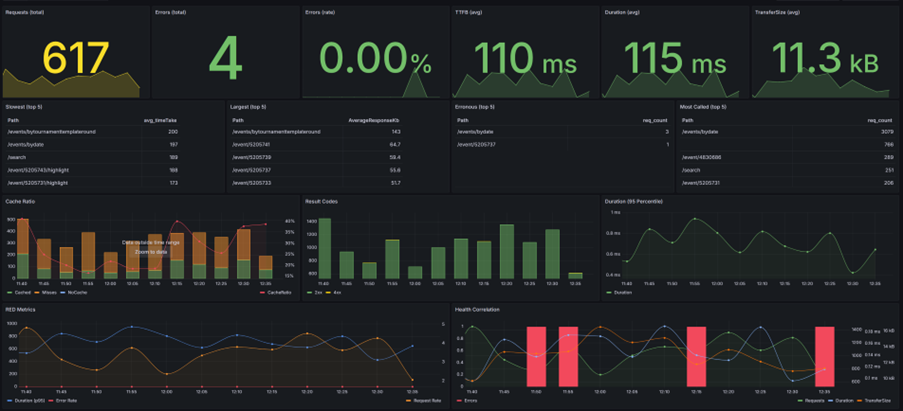
Monitoring endpoints in production
This dashboard does not measure why latency happens. It measures where to start looking.
I use dashboards like this to monitor endpoints in production. Not to admire graphs, but to understand how a system behaves under real traffic. Requests, errors, duration, TTFB and transfer size all tell part of the story.
Requests, Errors and Duration
In practice I often start with RED metrics: Requests, Errors and Duration. Together they reveal whether a system is operating normally or beginning to experience pressure.
Requests
The number of requests tells you how busy an endpoint is. Performance can be excellent when traffic is low and terrible during peak periods.
- Every endpoint has a capacity ceiling.
- You should roughly know where that ceiling is.
- Traffic changes the context of every metric.
Errors
Even healthy endpoints produce occasional errors. The internet creates noise: bots, scanners and broken clients.
- What matters is the error rate.
- Errors rising with load can indicate pressure.
- Isolated errors are often just internet noise.
Duration
Duration tells you how long work actually takes. When it drifts upward, the system is usually telling you something.
- Healthy systems behave predictably under load.
- P95 often matters more than averages.
- Latency rarely explodes. It drifts.
Where latency actually lives
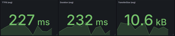
If TTFB is around 227 ms and total duration is around 232 ms, the difference is only a few milliseconds.
That tells us something important: almost all of the request time is spent processing the request before the first byte is sent.
- the response payload is small
- serialization overhead is low
- network transfer is not the bottleneck
In other words: the latency is almost entirely processing time, not transfer time.
Fast endpoints are designed that way
Latency is not only about infrastructure. It also reflects the design choices behind an API.
In this case, a response size of roughly 10 kB and a very small gap between TTFB and total duration usually indicate that the endpoint is doing exactly what it should do: returning only the data that is needed, keeping payloads small, and avoiding unnecessary work.
Well-designed APIs are predictable and fast
Poorly designed APIs tend to show up as large payloads, unnecessary joins, heavy object graphs and unpredictable database behavior.
- return only the data that is needed
- keep critical paths simple and deterministic
- avoid surprises in the database layer
No surprises in the database layer
In production systems, critical paths often deserve explicit queries. In many cases that means carefully written SQL, stored procedures and predictable execution plans, rather than hoping a complicated ORM-generated query will stay fast forever.
Performance is not something you add later. It starts with API design.
Understanding the relationship between signals
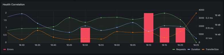
Production systems rarely explain themselves through a single metric. The real insight appears when you look at correlations.
If requests rise while duration stays stable, the endpoint is still operating comfortably within its limits.
The physics of latency
One aspect of latency engineers sometimes forget: physics gets a vote.
Signals cannot travel faster than the speed of light. In fiber optic cables that is roughly 200,000 km per second.
If your users sit in Australia and your service runs in West Europe, you will never reach 250 ms latency.
Sometimes latency is not a software problem. It is simply geography.
Conclusion
Dashboards do not fix latency problems. They tell you where to start digging. Healthy systems behave predictably under load. When the signals start drifting, it is time to investigate.
Comments
No comments yet.